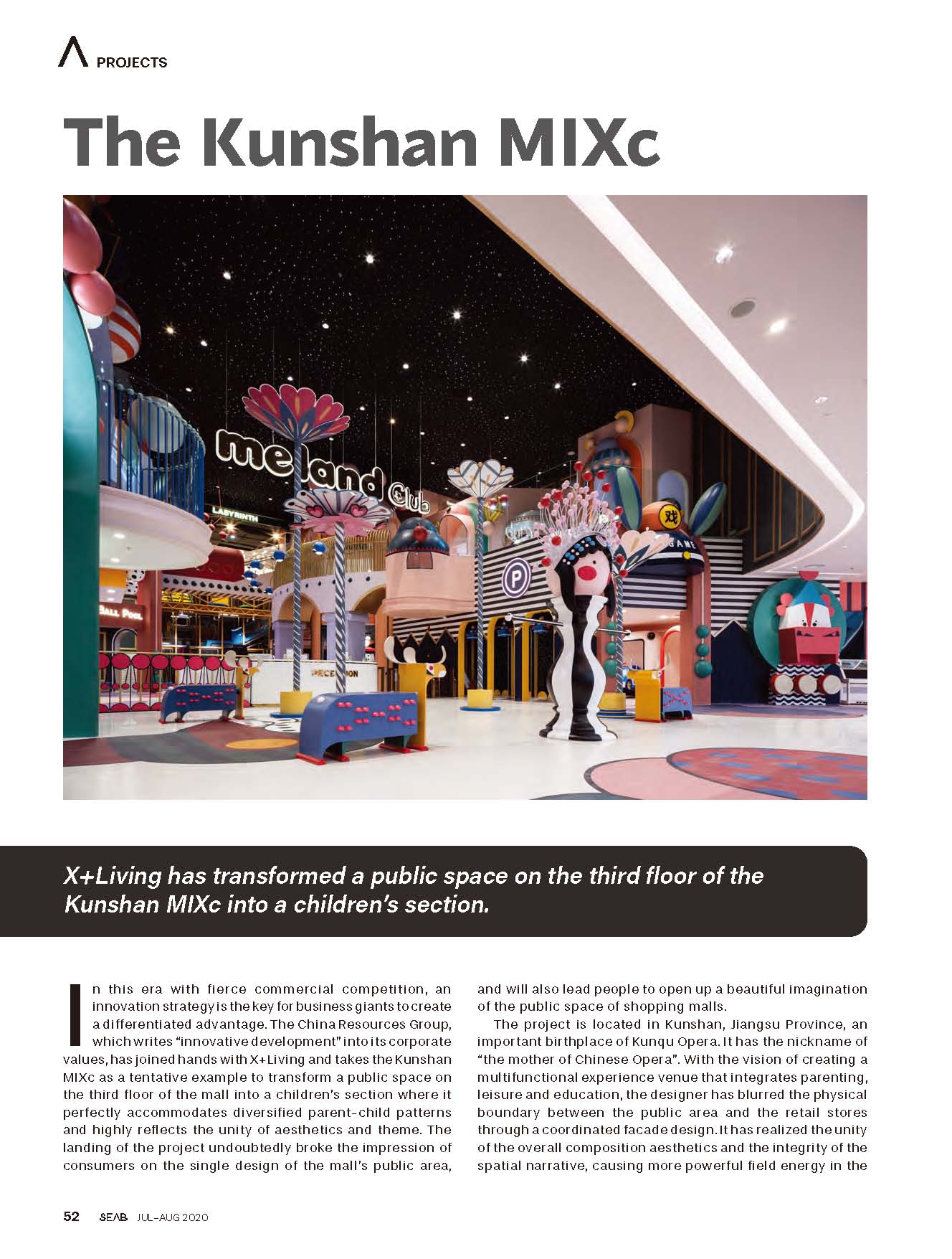
In this era with fierce commercial competition, an innovation strategy is the key for business giants to create a differentiated advantage. The China Resources Group, which writes “innovative development” into its corporate values, has joined hands with X+Living and takes the Kunshan MIXc as a tentative example to transform a public space on the third floor of the mall into a children's section where it perfectly accommodates diversified parent-child patterns and highly reflects the unity of aesthetics and theme. The landing of the project undoubtedly broke the impression of consumers on the single design of the mall's public area, and will also lead people to open up a beautiful imagination of the public space of shopping malls.
The project is located in Kunshan, Jiangsu Province, an important birthplace of Kunqu Opera. It has the nickname of “the mother of Chinese Opera”. With the vision of creating a multifunctional experience venue that integrates parenting, leisure and education, the designer has blurred the physical boundary between the public area and the retail stores through a coordinated facade design. It has realized the unity of the overall composition aesthetics and the integrity of the spatial narrative, causing more powerful field energy in the commercial space.
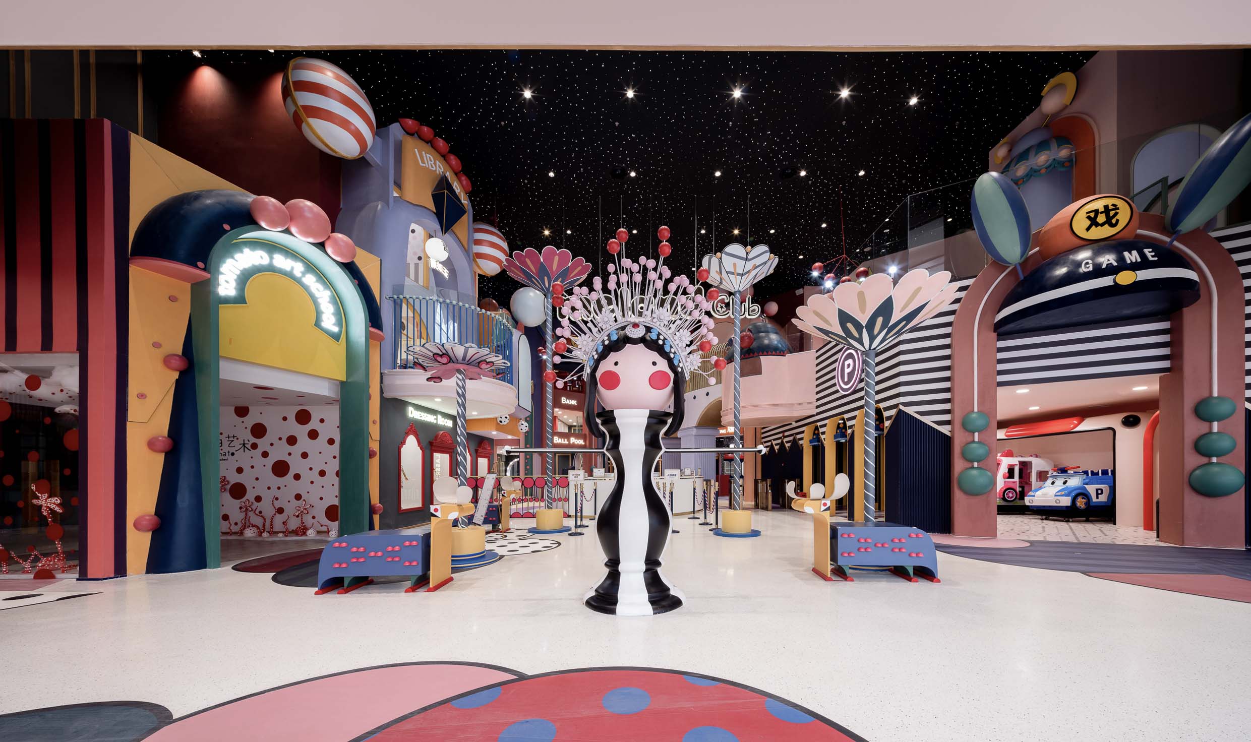
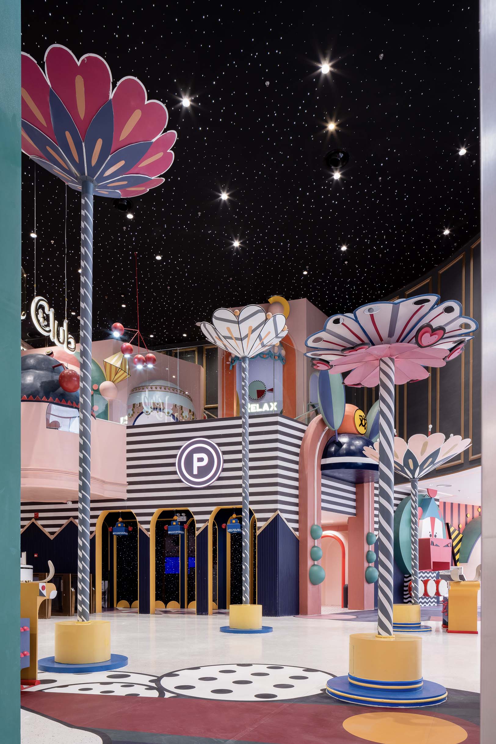
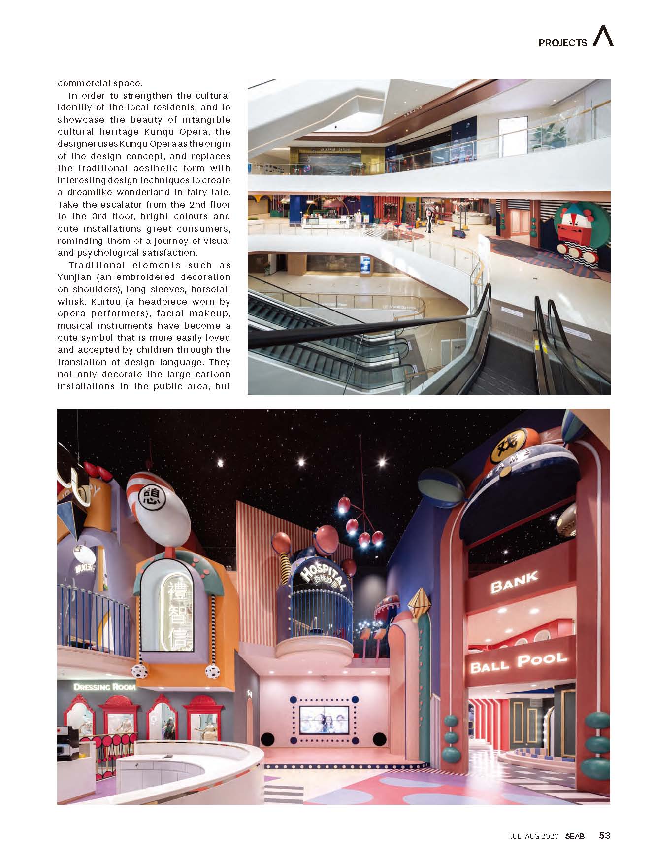
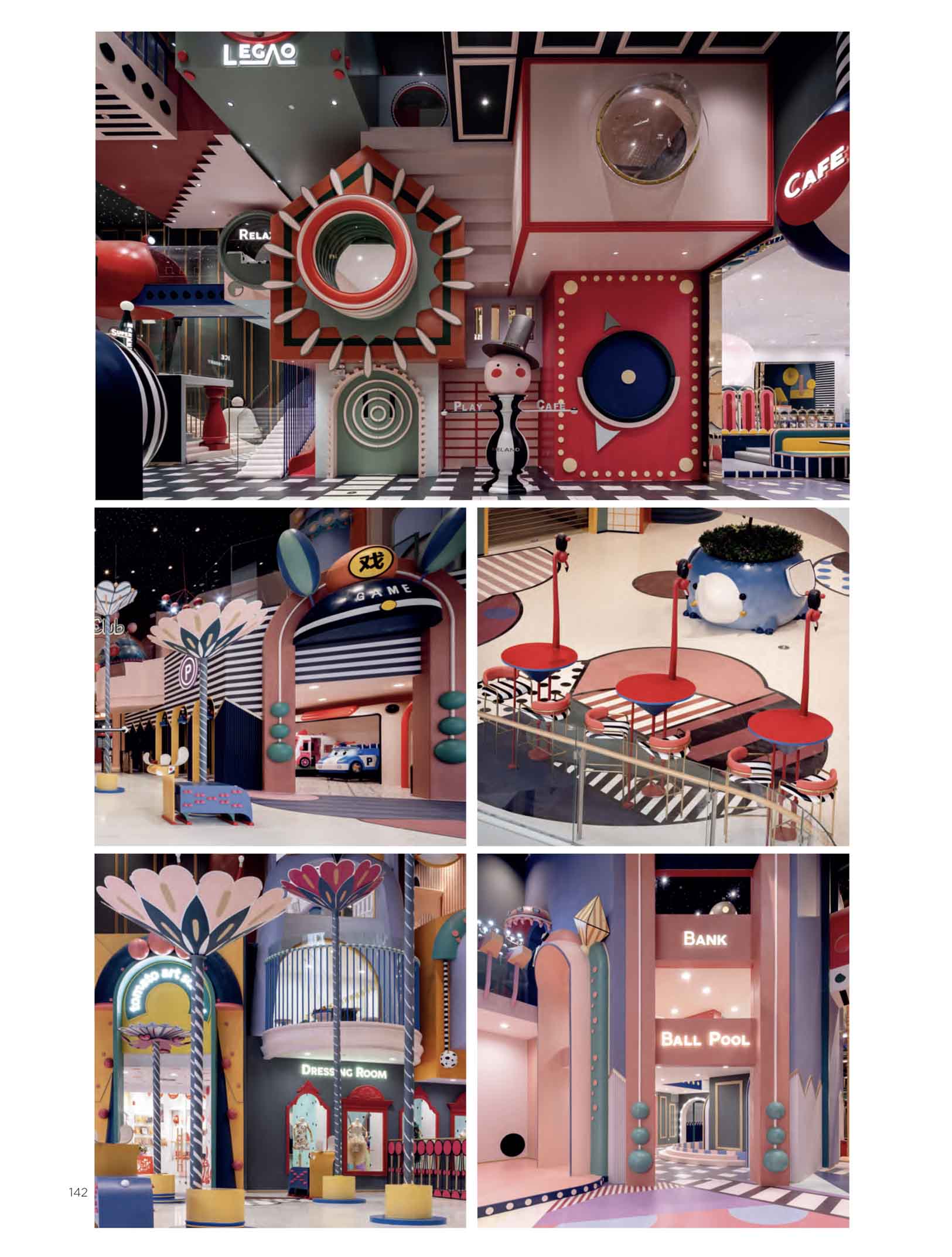
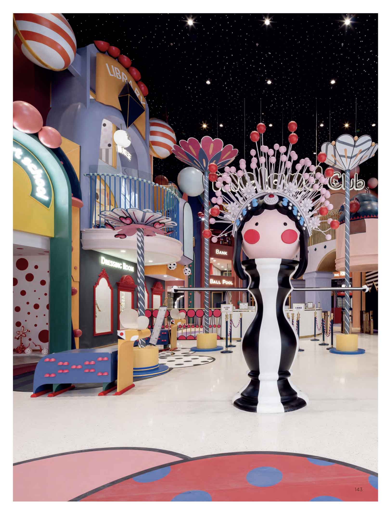
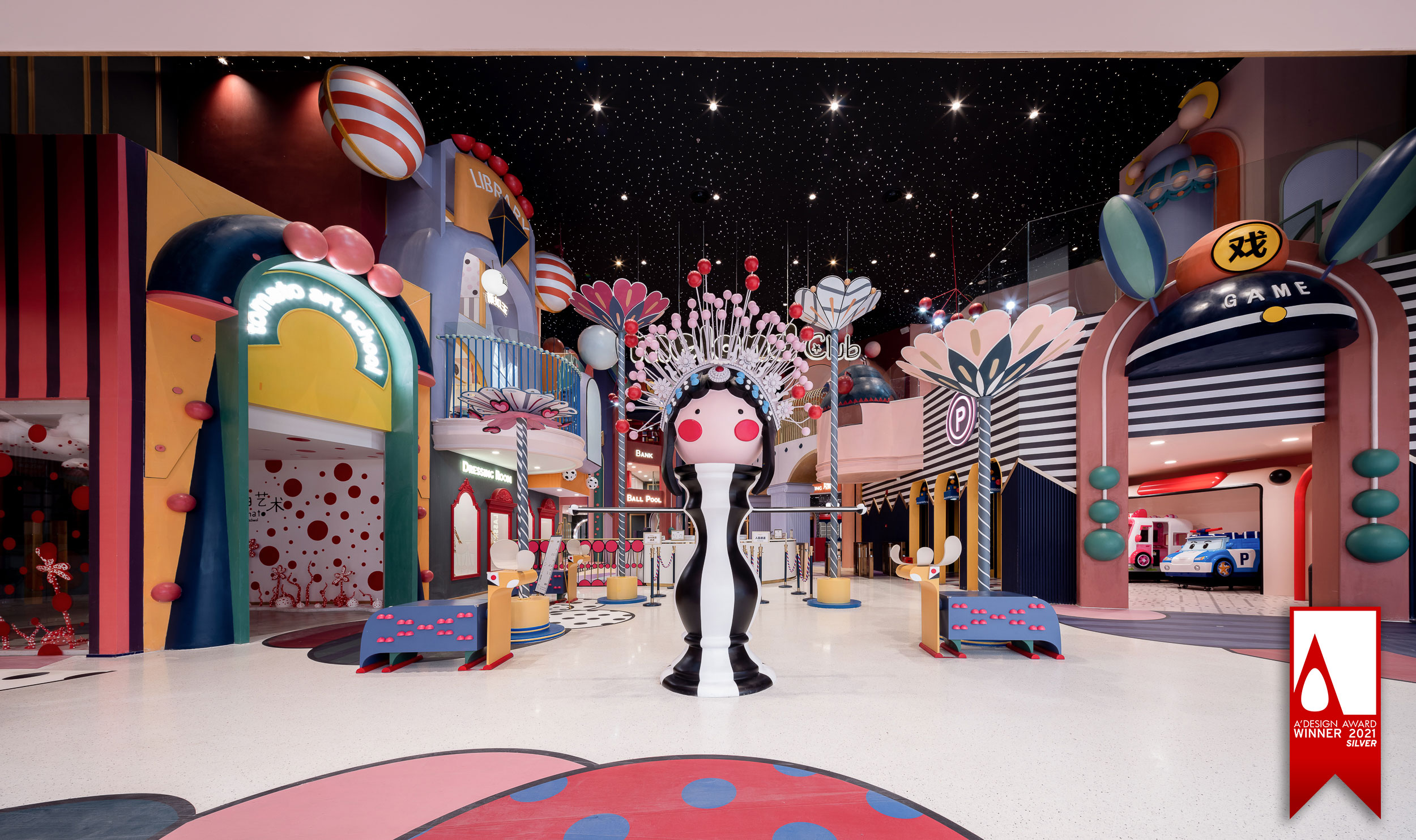
In order to strengthen the cultural identity of the local residents, and to showcase the beauty of intangible cultural heritage Kunqu Opera, the designer uses Kunqu Opera as the origin of the design concept, and replaces the traditional aesthetic form with interesting design techniques to create a dreamlike wonderland in fairy tale. Take the escalator from the 2nd floor to the 3rd floor, bright colors and cute installations greet consumers, reminding them of a journey of visual and psychological satisfaction.
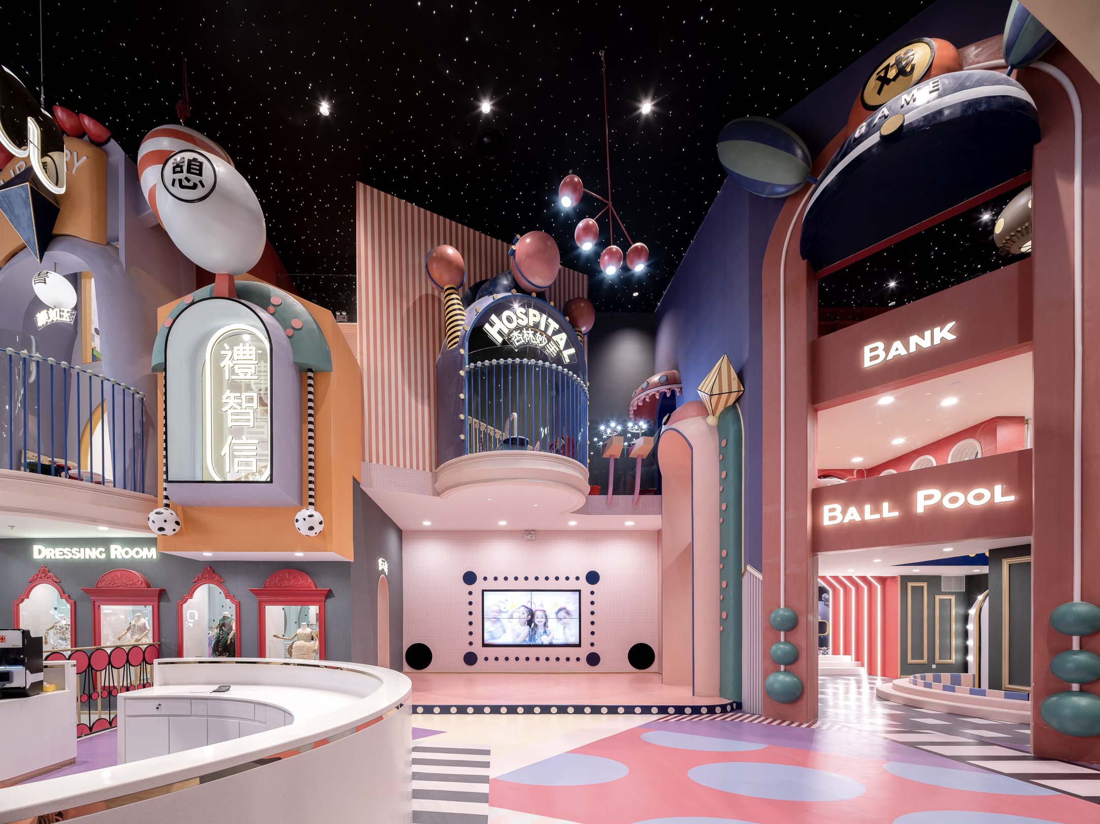
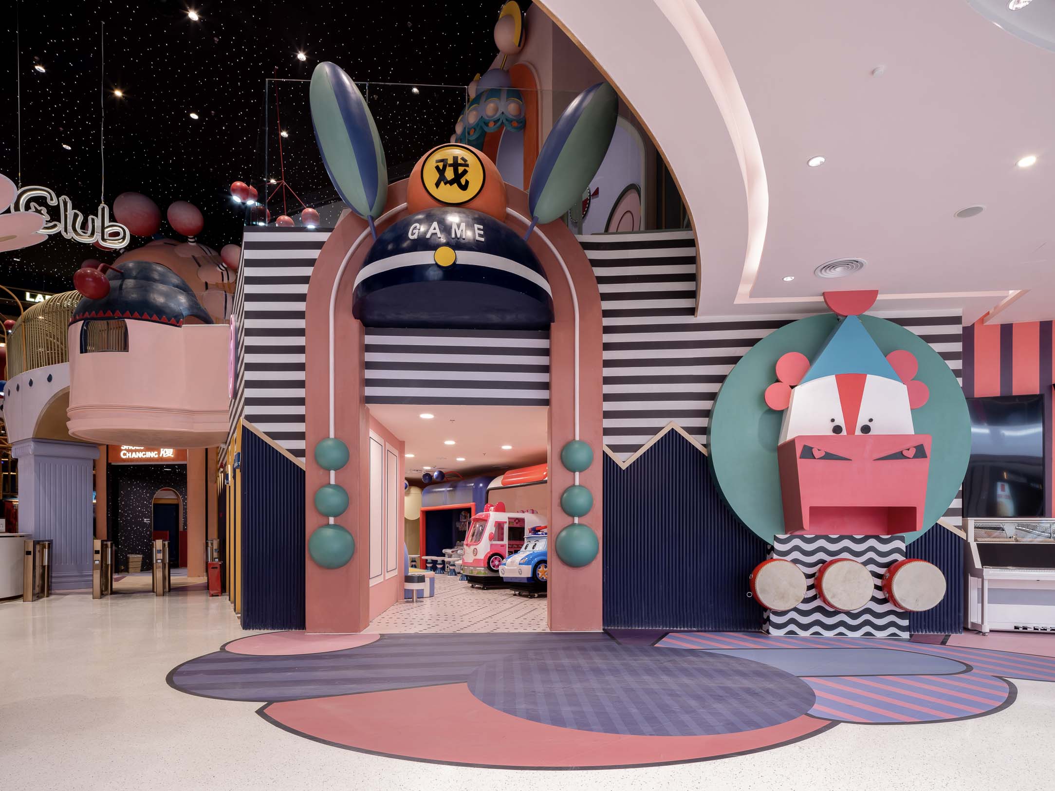
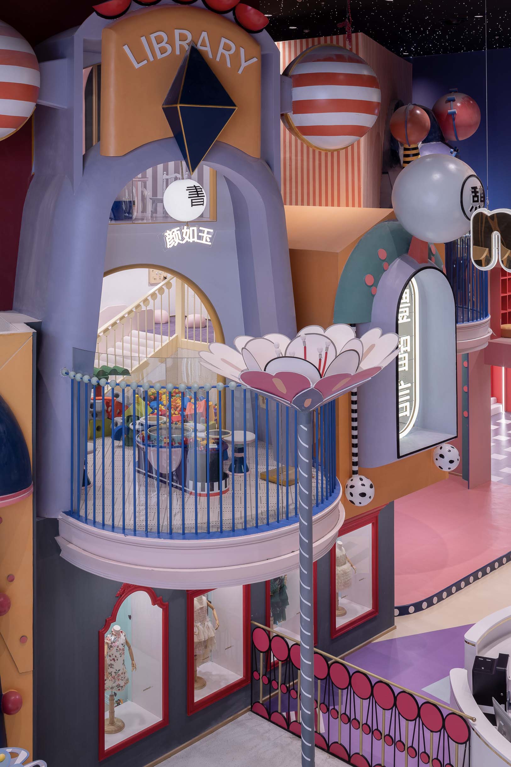
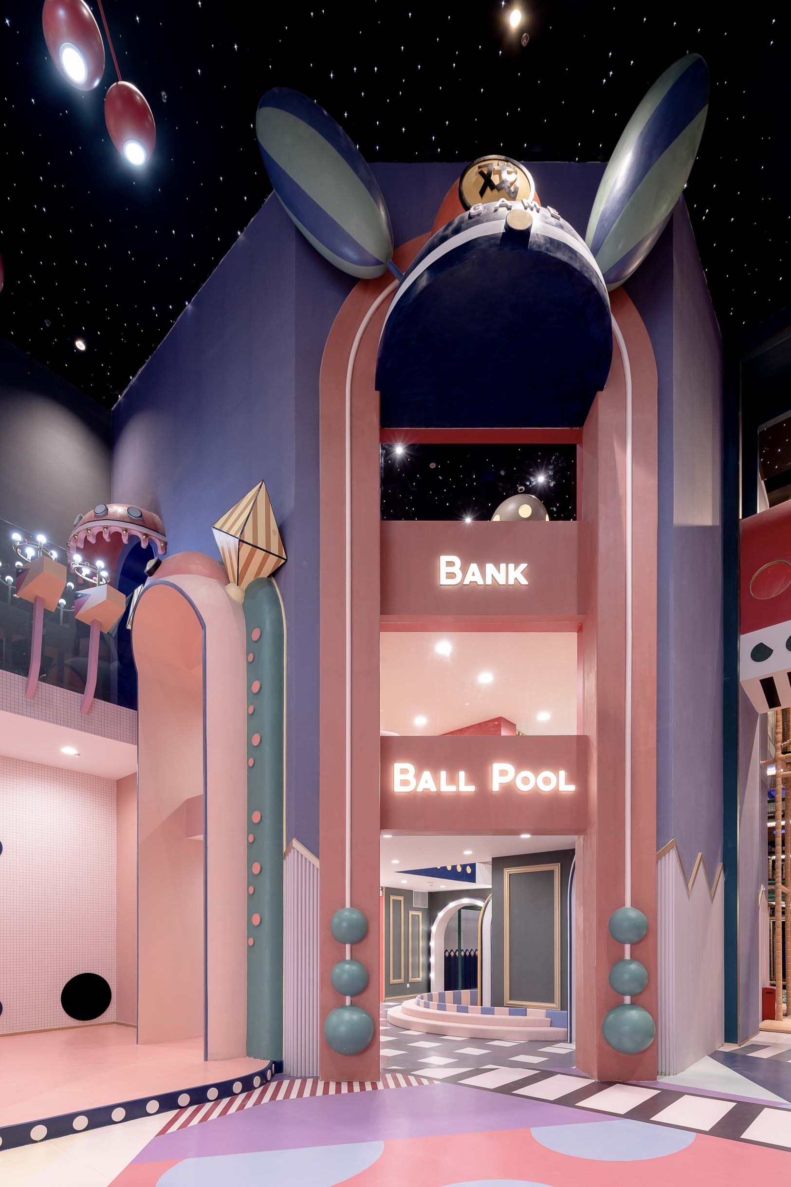
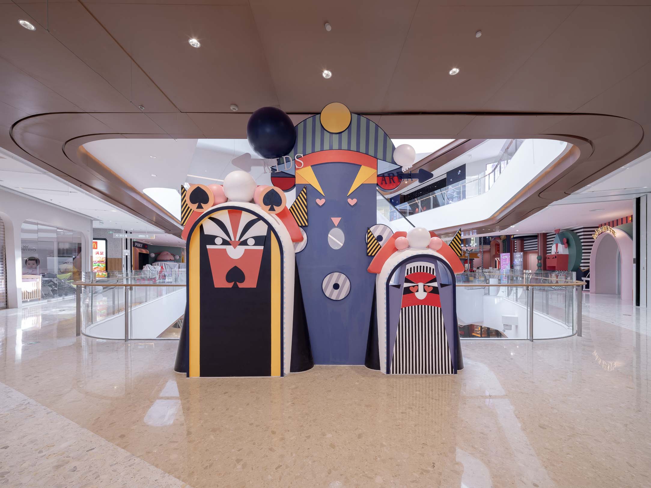
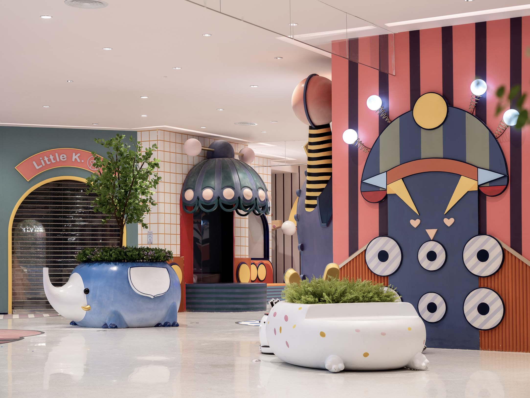
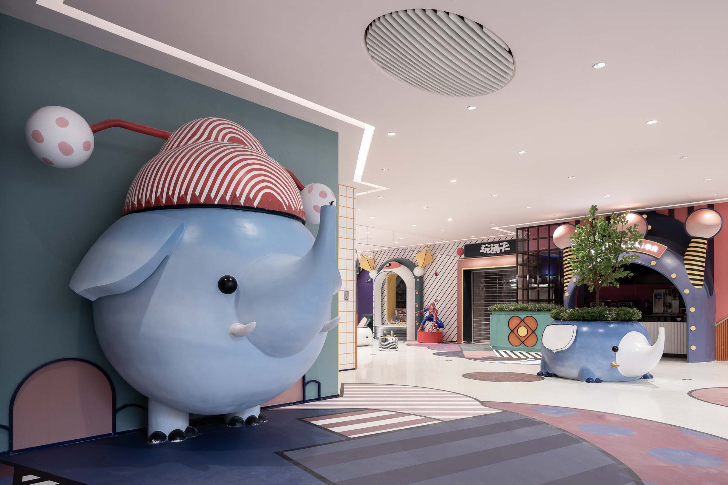
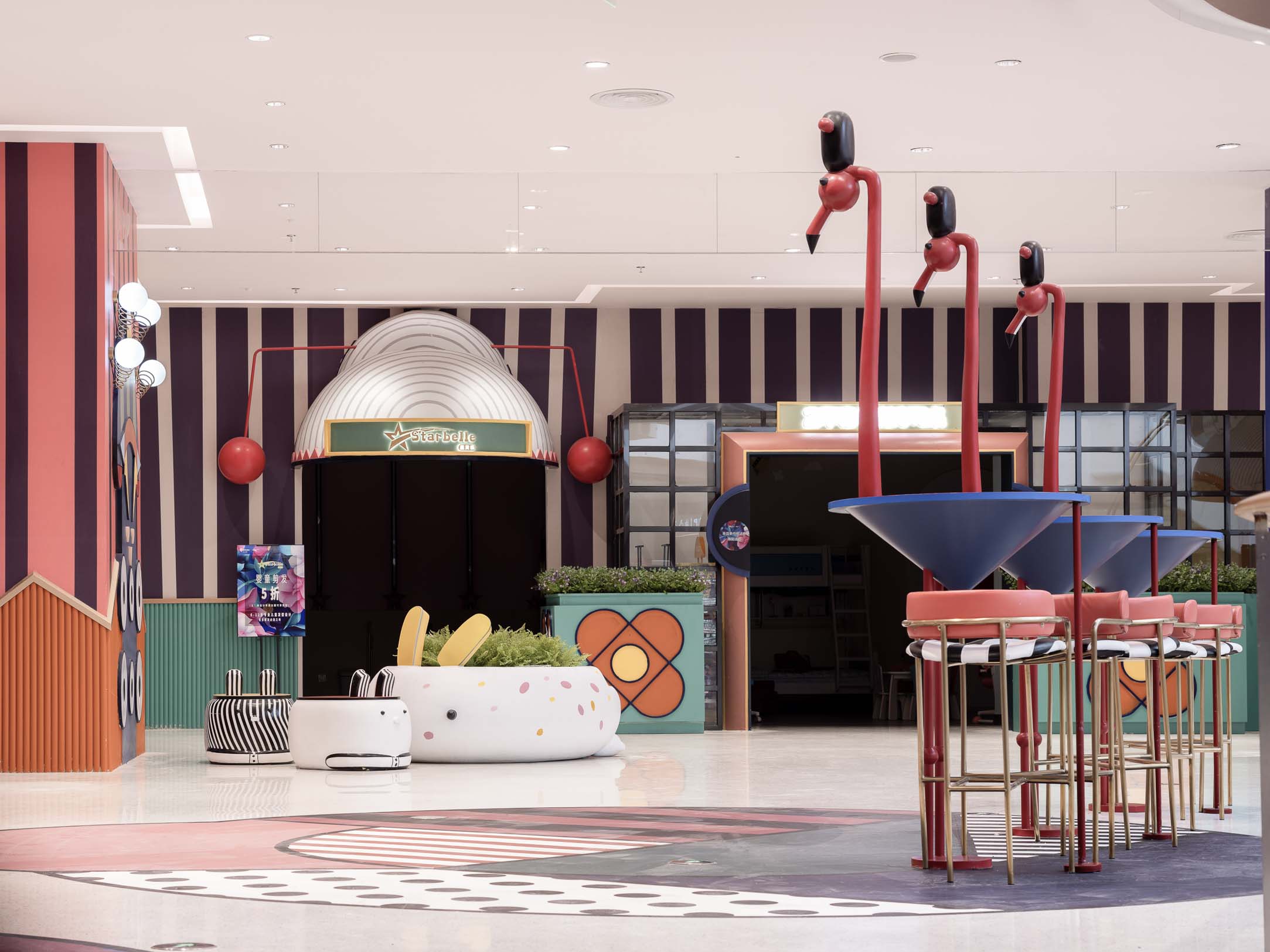
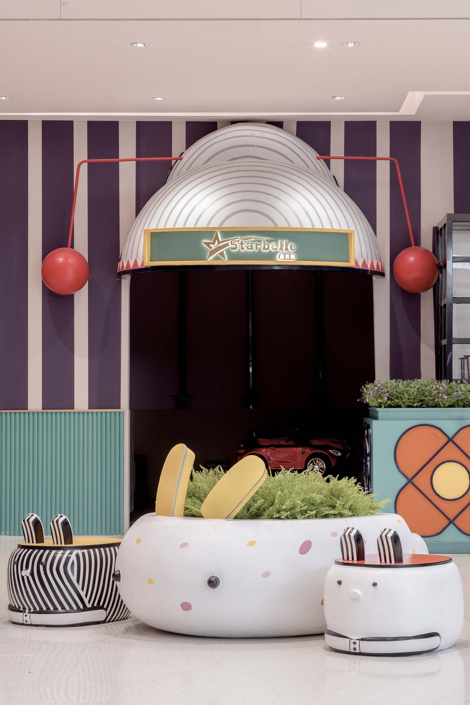
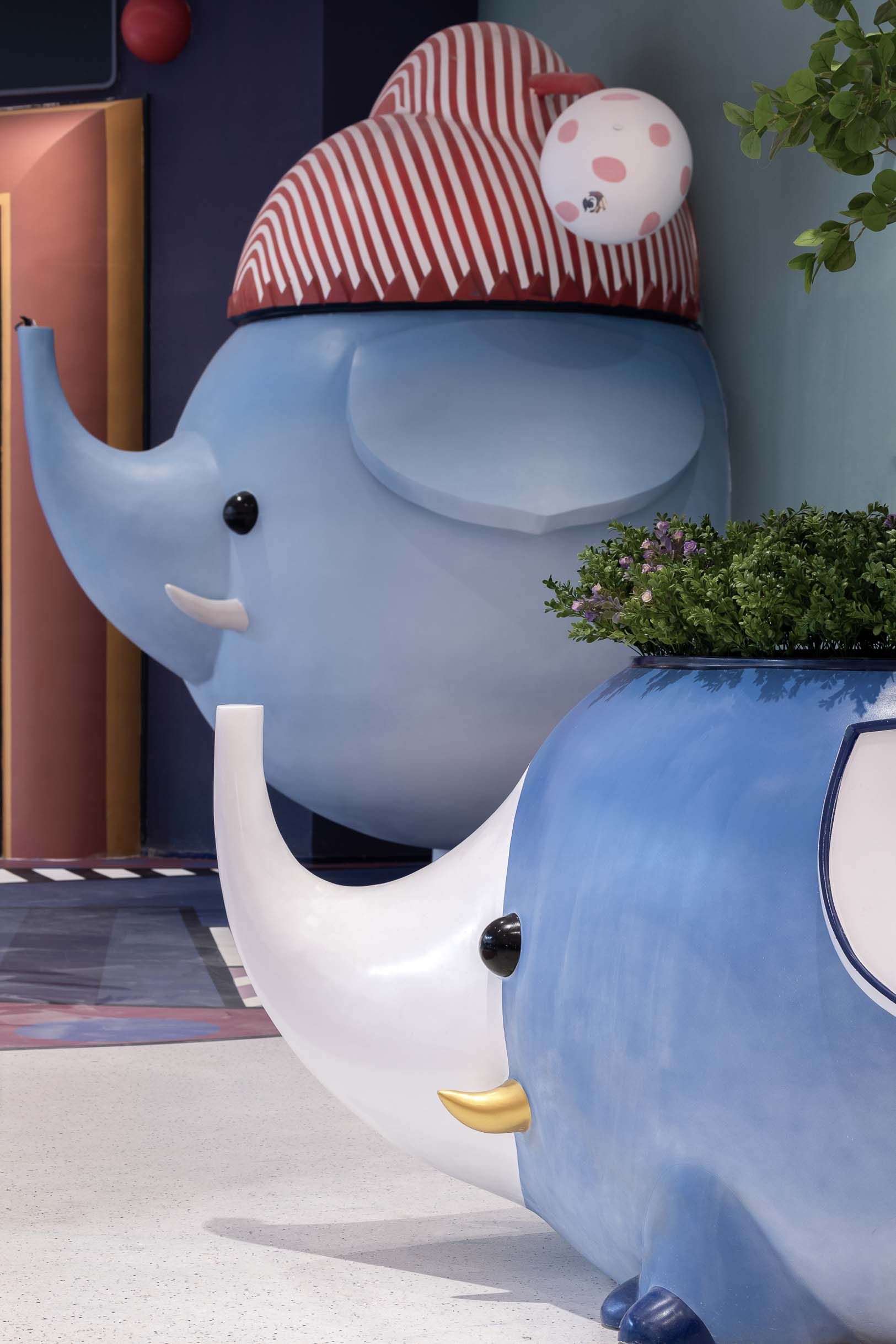
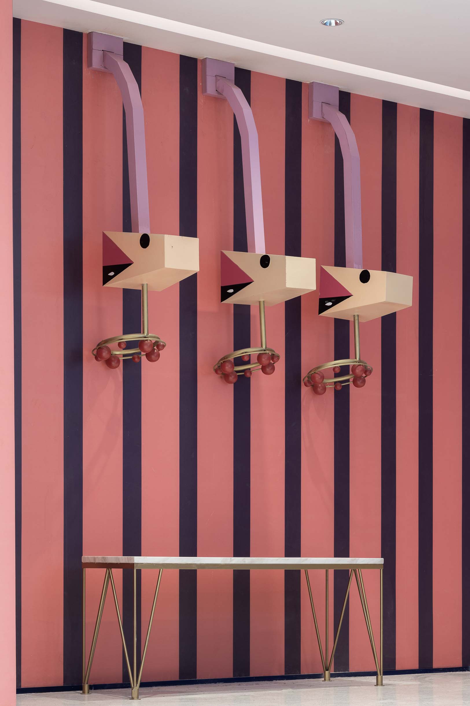
Traditional elements such as Yunjian(an embroidered decoration on shoulders), long sleeves, horsetail whisk, Kuitou(a headpiece worn by opera performers), facial makeup, musical instruments have become a cute symbol that is more easily loved and accepted by children through the translation of design language. They not only decorate the large cartoon installations in the public area, but also are incorporated into the signboards design. The lively color blocks and geometric patterns grounded together, together with the thematically modified guardrails have not only enhanced the identification of the children's section, but also perfectly set the mood of childlike feeling. Based on the scientific planning of the consumer movement, the designer has created a number of points of interest in the space. The customized furnishings works not only as the seats in the rest area, but also the interactive devices for the consumers to take a photo.
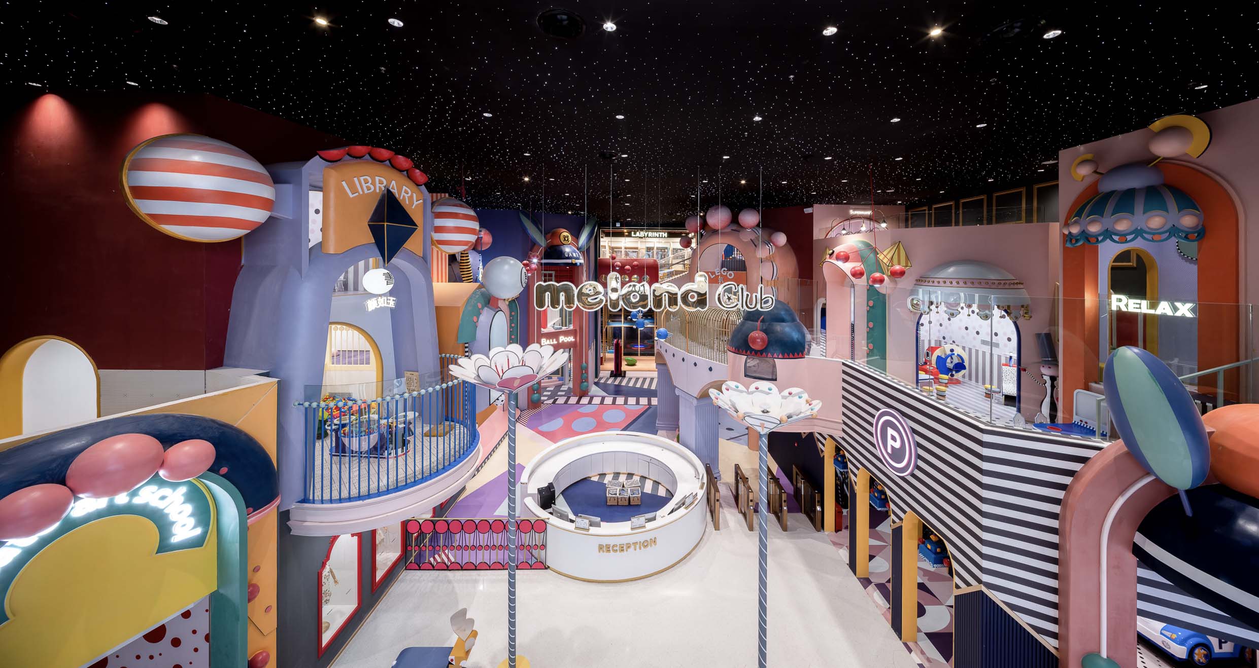
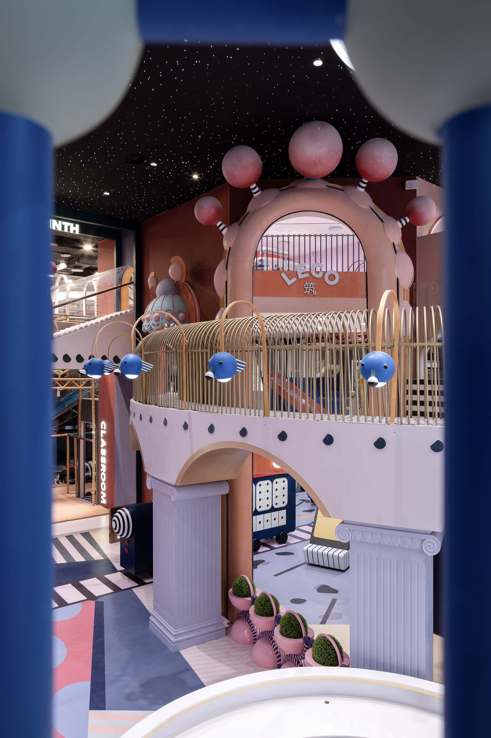
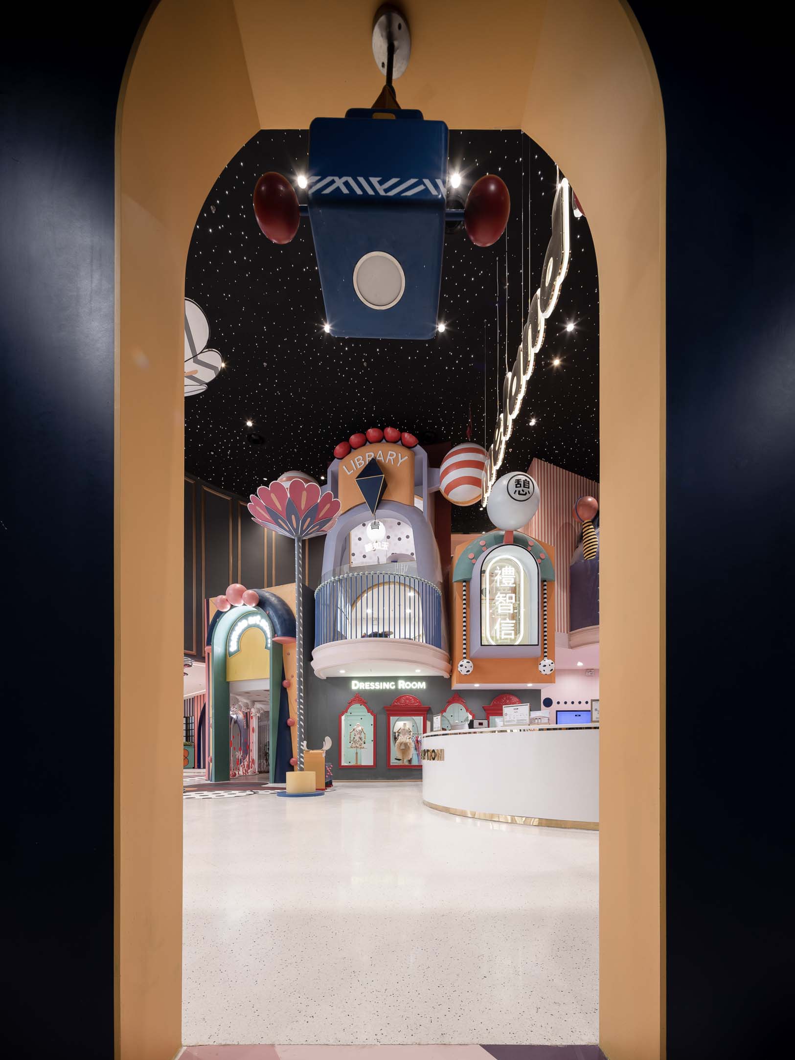
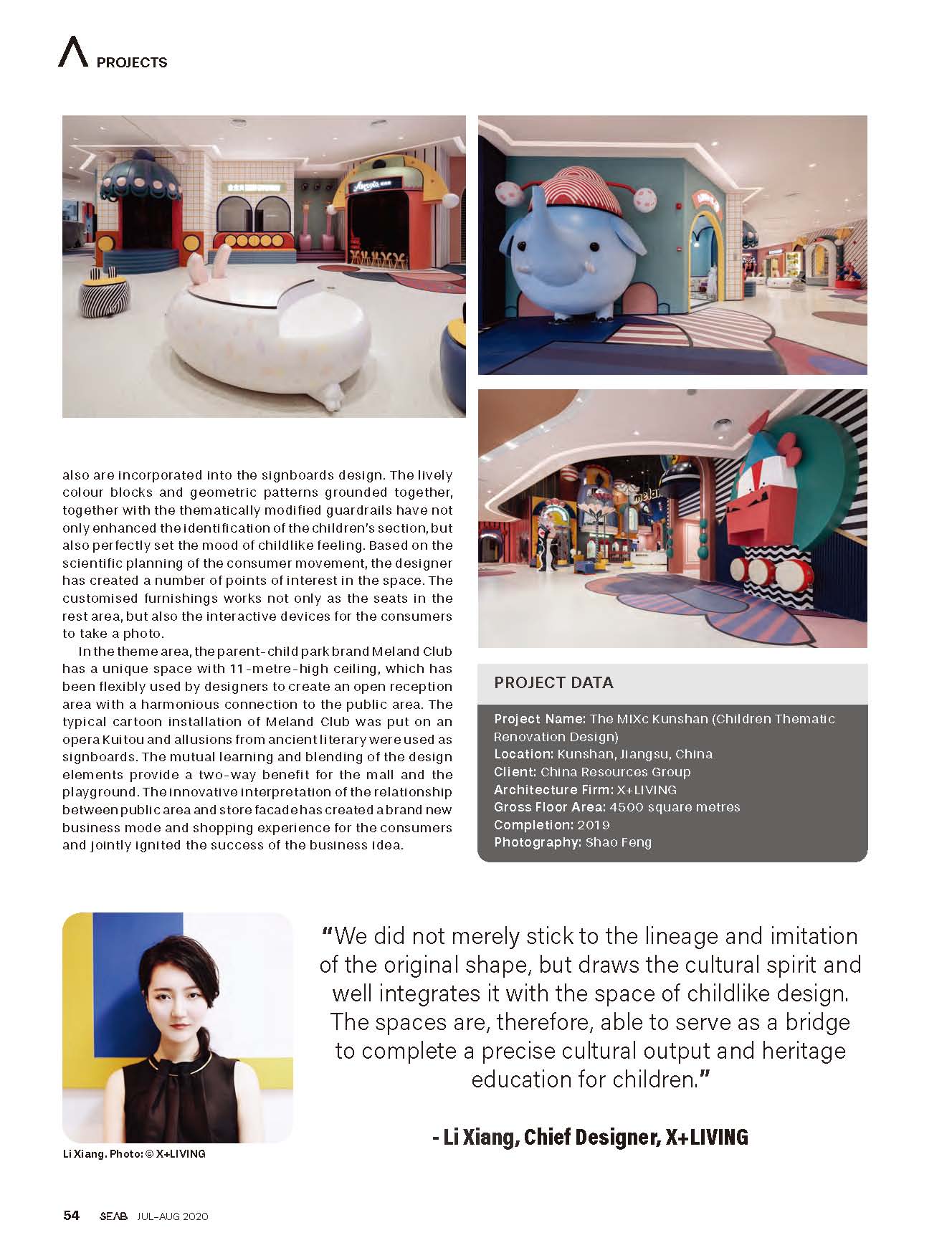
In the theme area, the parent-child park brand Meland Club has a unique space with 11-meter-high ceiling, which has been flexibly used by designers to create an open reception area with a harmonious connection to the public area. The typical cartoon installation of Meland Club was put on an opera Kuitou and allusions from ancient literary were used as signboards. The mutual learning and blending of the design elements provide a two-way benefit for the mall and the playground. The innovative interpretation of the relationship between public area and store facade has created a brand new business mode and shopping experience for the consumers and jointly ignited the success of the business idea.
The designer does not merely stick to the lineage and imitation of the original shape, but draws the cultural spirit and well integrates it with the space of childlike design. The space are, therefore, able to serve as a bridge to complete a precise cultural output and heritage education for children. The symbolic extraction of traditional opera culture, combined with the childhood fun, reflects the designer's thinking about the contemporary expression of traditional art elements. The designers who challenged the single-community design with anti-patterning thinking and explored the subversive method have successfully fulfilled the design mission of breaking the old consumer's main behavior and reorganizing the traditional business layout.
In this era with fierce commercial competition, an innovation strategy is the key for business giants to create a differentiated advantage. The China Resources Group, which writes “innovative development” into its corporate values, has joined hands with X+Living and takes the Kunshan MIXc as a tentative example to transform a public space on the third floor of the mall into a children's section where it perfectly accommodates diversified parent-child patterns and highly reflects the unity of aesthetics and theme. The landing of the project undoubtedly broke the impression of consumers on the single design of the mall's public area, and will also lead people to open up a beautiful imagination of the public space of shopping malls.
The project is located in Kunshan, Jiangsu Province, an important birthplace of Kunqu Opera. It has the nickname of “the mother of Chinese Opera”. With the vision of creating a multifunctional experience venue that integrates parenting, leisure and education, the designer has blurred the physical boundary between the public area and the retail stores through a coordinated facade design. It has realized the unity of the overall composition aesthetics and the integrity of the spatial narrative, causing more powerful field energy in the commercial space.
In order to strengthen the cultural identity of the local residents, and to showcase the beauty of intangible cultural heritage Kunqu Opera, the designer uses Kunqu Opera as the origin of the design concept, and replaces the traditional aesthetic form with interesting design techniques to create a dreamlike wonderland in fairy tale. Take the escalator from the 2nd floor to the 3rd floor, bright colors and cute installations greet consumers, reminding them of a journey of visual and psychological satisfaction.
Traditional elements such as Yunjian(an embroidered decoration on shoulders), long sleeves, horsetail whisk, Kuitou(a headpiece worn by opera performers), facial makeup, musical instruments have become a cute symbol that is more easily loved and accepted by children through the translation of design language. They not only decorate the large cartoon installations in the public area, but also are incorporated into the signboards design. The lively color blocks and geometric patterns grounded together, together with the thematically modified guardrails have not only enhanced the identification of the children's section, but also perfectly set the mood of childlike feeling. Based on the scientific planning of the consumer movement, the designer has created a number of points of interest in the space. The customized furnishings works not only as the seats in the rest area, but also the interactive devices for the consumers to take a photo.
In the theme area, the parent-child park brand Meland Club has a unique space with 11-meter-high ceiling, which has been flexibly used by designers to create an open reception area with a harmonious connection to the public area. The typical cartoon installation of Meland Club was put on an opera Kuitou and allusions from ancient literary were used as signboards. The mutual learning and blending of the design elements provide a two-way benefit for the mall and the playground. The innovative interpretation of the relationship between public area and store facade has created a brand new business mode and shopping experience for the consumers and jointly ignited the success of the business idea.
The designer does not merely stick to the lineage and imitation of the original shape, but draws the cultural spirit and well integrates it with the space of childlike design. The space are, therefore, able to serve as a bridge to complete a precise cultural output and heritage education for children. The symbolic extraction of traditional opera culture, combined with the childhood fun, reflects the designer's thinking about the contemporary expression of traditional art elements. The designers who challenged the single-community design with anti-patterning thinking and explored the subversive method have successfully fulfilled the design mission of breaking the old consumer's main behavior and reorganizing the traditional business layout.